One of my all-time favorite creative meditations is color matching. It is very engaging and makes your brain tickle in a nice way.
Take any object and try to match its color.
One of my art classes long ago had us paste a scrap of patterned fabric to canvas and then continue the pattern from the edges outward. The goal was to mix paint to match exactly so that you couldn’t tell where the fabric ended and your painting started. We spent hours on that exercise and I still remember the golden brown, reddish violet, and olive green of that fabric. They were interesting and difficult colors to match. (And now that I think about it, they appear in my art quite often even twenty years later.)
You don’t need to spend hours on this. Get more enjoyment by relaxing perfection. “Close enough” is plenty to aim for in meditation when the point isn’t a perfect result but the mindful practice itself.
Materials
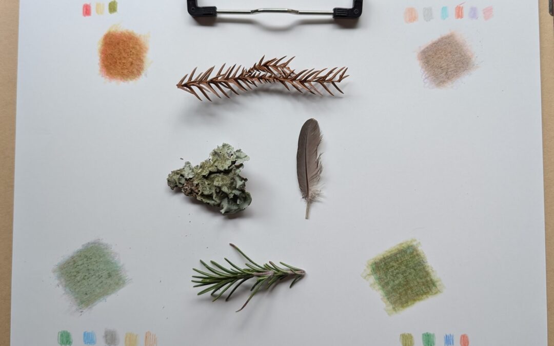
Object. You can choose any object – nature is full of interesting colors, as shown above. But so is your office desk, your kitchen, your studio. Grab anything and see if you can recreate its color.
Colors. Colored pencils work well, as do crayons or any dry medium that can be lightly layered will work. I find that colored pens usually let me down because their ink is too saturated. Paint is great fun to mix.
You don’t even need that many colors. A clear red/magenta, blue/cyan and yellow will get you a close match to almost anything if you are patient. Adding white and black gives you tonal options for pastels and deep shades.
Surface. I like smooth Kent paper for dry medium because it lets you build up many layers. If you’re painting, choose an appropriate canvas.
Color Theory
It is helpful to understand basic color theories like the color wheel and what happens when you mix colors. You probably learned some of this in school.
Mixing two primary colors makes a color in between:
Red + Yellow = Orange
Red + Blue = Purple
Blue + Yellow = Green
Opposite colors on the wheel make brown:
Red + Green = Brown
Blue + Orange = Brown
Yellow + Purple = Brown
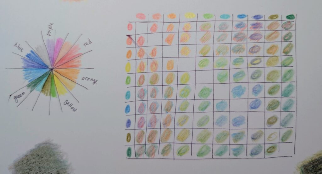
Making a mixing chart with your set of pencils can help you to understand what exact two-color combinations you can expect. Every brand of pencil is different even when the colors have the same name. To make a mixing chart, make a grid with as many columns and raws as the number of pencils you have. Then color by color, fill in each row and column overlapping the colors. Try to use consistent pressure throughout to help show the coverage of the color.
The Practice
This describes using colored pencils; adapt as needed for other media
- Take your materials and find a comfortable seat where the light is good, like a sunny window or a well lit desk. You want to be able to distinguish the subtle color differences.
- Compare the tips of your pencils to the object. Do you see any close matches? What colors contrast?
- Observe your object and name its color. “This lichen is a greyish green.” “This cedar twig is reddish brown.” Now you have a starting point. Greyish green will have tones of blue, yellow, white, and black. Reddish brown will use red and green with the emphasis on red.
- Lay a single color down as a base. Do it lightly. You’ll be adding many layers and the color will build up a little at a time.
- Compare the object to the color by placing it on top of or next to the color. Squint your eyes to blur the line between them. It probably doesn’t match yet. Is the object more yellow? Brown? Bluish?
- Continue adding layers and making comparisons. Eventually, after many layers, you will get to the color of your object.
NOTES
Take your time. Treat this like any meditative practice. Allow yourself relax into process. Give your intuition space to wander while your hands, eyes, and brain produce the color.
Make a reference in the margin for each pencil used as you go along. It’s interesting to see what colors came together to form the final shade.
You will make mistakes – maybe the object wasn’t more yellow, after all. When that happens, since you can not erase a layer, add a layer of the opposite color to neutralise the mistake or add more of the base color. Going in the wrong direction is a great way to learn about color.
Colored pencils may not be saturated enough to do deep colors or you may overshoot a pastel, so focus on the color rather than its tint or shade. “It’s this color but darker” is a fine place to end your color meditation.